UI Overhaul #1
Runeseeker » Devlog


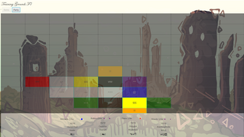
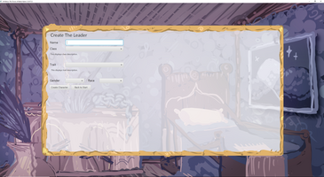
As part of Alpha 3 work, one of the things that's planned is to make the UI better by keeping to a single resolution (1080p). Here is the results of this labor. Most screens will have a frame around the center, and when full screen, the background image grows while keeping the content centralized.
For dungeon screen, not only does this happen but also you now have a background of the dungeon that you're in. Which makes everything look nicer.
Get Runeseeker
Runeseeker
An adventure RPG adventure in an alternate history, where the Tower of Babel was built, and empires never die.
| Status | In development |
| Author | luciahill |
| Genre | Adventure, Role Playing |
| Tags | Text based |
| Languages | English |
More posts
- Alpha 3 Released & Enhanced Change LogAug 18, 2022
- The Future of RuneseekerAug 18, 2022
- Alpha 3 Release UpdateAug 16, 2022
- Alpha 2 0.05 Released!Jul 03, 2022
- RoadmapJul 03, 2022
- Video #1: Demo of WIP Alpha 2Jul 01, 2022
- Discussion About BattleJun 19, 2022
- Alpha 1 Released!Jun 06, 2022
Leave a comment
Log in with itch.io to leave a comment.